最低限おぼえておきたい動き
-くるっ(CSS)-
See the Pen 4-3 最低限覚えておきたい現れ方 - くるっ by 動くWebデザインアイディア帳 (@ugokuweb) on CodePen.
「Result」下のRerunを押して動きを確かめてね!↑
動きを実現する仕組み
CSS アニメーションで実現するくるっと回る方法です。
このサンプルは、画面を開いたらすぐに動きます。
スクロールをして動かす、といったきっかけを指定したい場合は、「jQuery とCSS を組み合わせてスクロールをしたら要素を動かす」を参考にしてください。
HTMLの書き方
■HTMLの要素は自由です。
指定した対象がインライン要素(例<span>タグなど)の場合はCSSでdisplay:block;を指定し、ブロック要素にしてから動かしましょう。
<NG例>https://coco-factory.jp/ugokuweb/wp-content/themes/ugokuweb/data/work/inline_rotateng/
<OK例>https://coco-factory.jp/ugokuweb/wp-content/themes/ugokuweb/data/work/inline_rotateok/
<div class="rotateX">くるっX軸(縦へ)</div>
<div class="rotateY">くるっY軸(横へ)</div>
<div class="rotateLeftZ">くるっZ軸(左へ)</div>
<div class="rotateRightZ">くるっZ軸(右へ)</div>
自作のCSS内の書き方
/* X 軸(縦へ) */
.rotateX{
	animation-name:rotateXAnime;
	animation-duration:1s;
	animation-fill-mode:forwards;
}

@keyframes rotateXAnime{
	from{
		transform: rotateX(0);
		}
	to{
		transform: rotateX(-360deg);
		}
}


/*  Y 軸(横へ) */
.rotateY{
	animation-name:rotateYAnime;
	animation-duration:1s;
	animation-fill-mode:forwards;
}

@keyframes rotateYAnime{
	from{
		transform: rotateY(0);
		}
	to{
		transform: rotateY(-360deg);
		}
}


/* Z 軸(左へ) */
.rotateLeftZ{
	animation-name:rotateLeftZAnime;
	animation-duration:1s;
	animation-fill-mode:forwards;
}

@keyframes rotateLeftZAnime{
	from{
		transform: rotateZ(0);
		}
	to{
		transform: rotateZ(-360deg);
		}
}


/* Z 軸(右へ) */
.rotateRightZ{
	animation-name:rotateRightZAnime;
	animation-duration:1s;
	animation-fill-mode:forwards;
}

@keyframes rotateRightZAnime{
	from{
		transform: rotateZ(0);
		}
	to{
		transform: rotateZ(360deg);
		}
}
この技術を使ったサンプルサイト
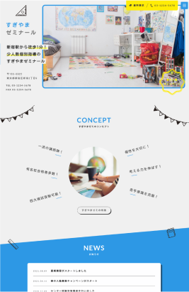
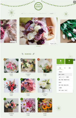
バリエーション
を見る


「印象」に関わる
動き一覧


基礎から学びたい方へ
Webサイトの動きを実現する仕組みと
準備について基礎から学びたい方は
下記をまず読み、基本を理解してから
コピペしましょう
Webサイトの動きを
実現する仕組みと準備
書籍情報
紙面だからこそできるまとめ方でコードを説明し、
全体を俯瞰して調べることが出来る構成になっています。
もちろん、パーツのサンプルコードもzipでまとめてダウンロードできます。
購入をしてくださった方には特典がありますので是非チェックしてみてください!